
Ease Construction
Modernizing a 10-year-old enterprise platform
- Timeline
- 2019–2021
- My role
- Sole product designer
External consultant - Team
- PM · frontend developer
tester · backend support - System
- 14,000+ active sites
4 countries
Built in 2009
Context
Infobric Ease Construction handles access control, workforce presence, and Sweden’s statutory electronic staff ledger across 14,000+ active sites in four countries. Site managers and administrators use it every day. The interface was dated: an Outlook 2007-style UI built in 2009 and left visually unchanged for more than a decade.
The project
Nobody asked for this project.
- 10+ years without a redesign
- 1 product designer
- CSS layer over existing markup
From speculative concept to approved work
I had just designed a mobile app for Infobric as an external consultant. The larger web platform was still there: dense, decade-old, and without design ownership. It had no brief and no budget.
The PM and I did not begin with a full redesign plan; we built a speculative concept and paired it with a credible path to production: a new CSS layer over existing markup, with the logic left in place. We presented both. The work was approved.
The project ran from 2019 to 2021. It ended when Infobric retired the 2009 interface.
 Scope, constraints, and risk
- Redesign the full interface without breaking existing workflows, then move an established user base without disrupting daily site operations.
- The work was not a rebuild; it was a CSS layer over existing markup and logic. That constraint made the project affordable and kept every decision tied to what one frontend developer could ship. A backend developer supported a small set of approved logic changes.
- Ease is also the legal staff ledger and the control layer for physical site access. Every relevant state, exception, and error had to be specified, tested, and documented.
 What I owned
- Set the visual direction and secured the client’s agreement on scope.
- Mapped every screen crucial for delivery and every UI element that needed updating (grids, modals, ribbons, pickers, alerts, tooltips, pagination).
- Built the design system in Zeplin for direct developer handoff.
- Designed the staged rollout strategy and feedback collection system.
- Analyzed user feedback, coded all comments, and turned findings into product changes.
- Turned complaints about speed into a case that won budget for performance work.
How I covered the system
I could not redesign a decade of accumulated UI screen by screen. I reduced the scope with two rules: specify what repeats, and specify what carries risk.
 What repeats
Coverage came from shared patterns. I reduced 27 ribbons (the bar of tabs and buttons above a screen) to one specification, 18 data grids to one grid pattern, and 28 status icons to one set. Specify once. Carry it through the product.
 What carries risk
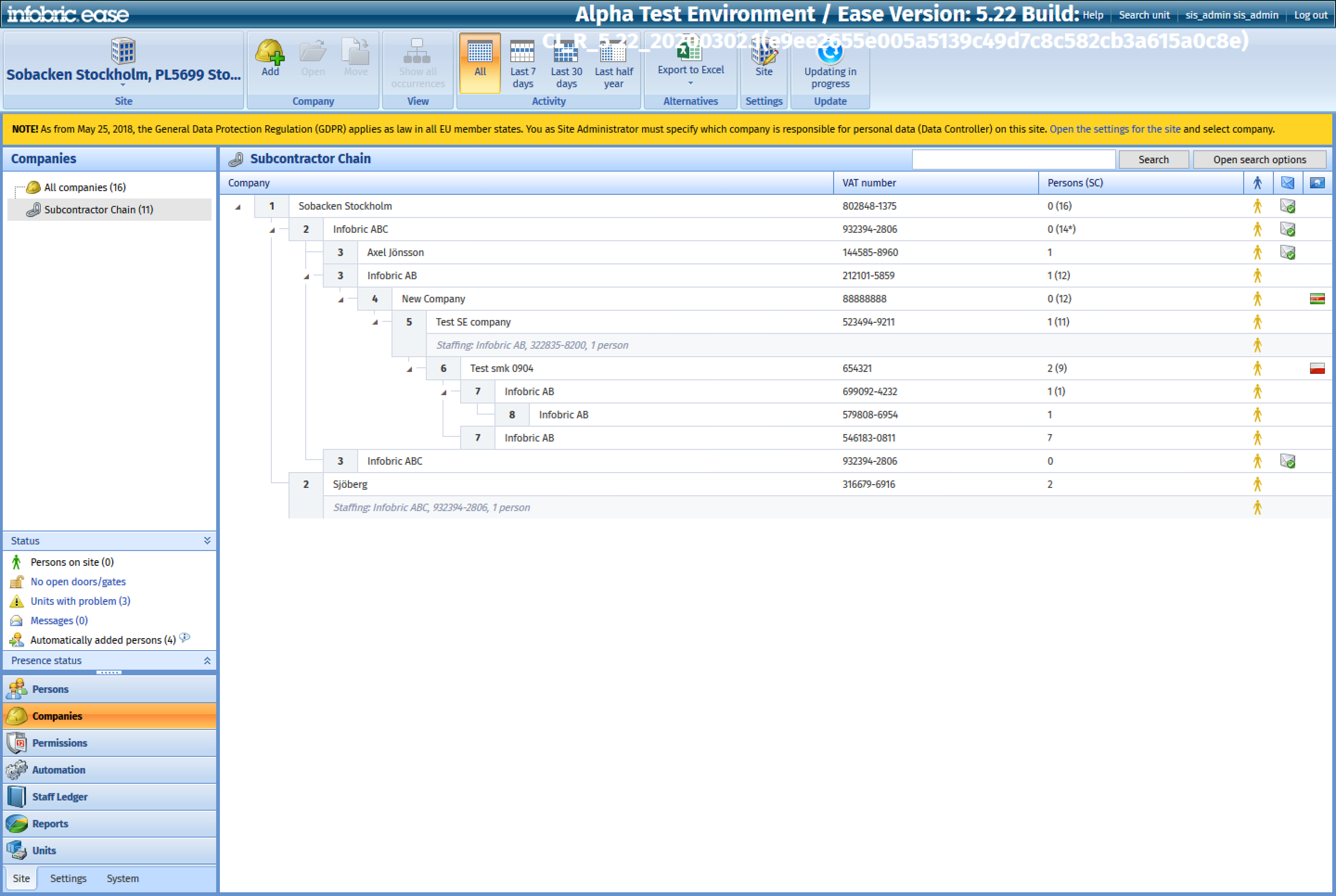
Reuse did not decide everything. Ease is the statutory staff ledger and controls who can enter a construction site; a misread row can put the wrong person on site or leave the wrong company carrying liability. The permission matrix and the subcontractor tree appear on only a few screens, yet both received full specifications. When reuse and consequence pointed in different directions, consequence won.
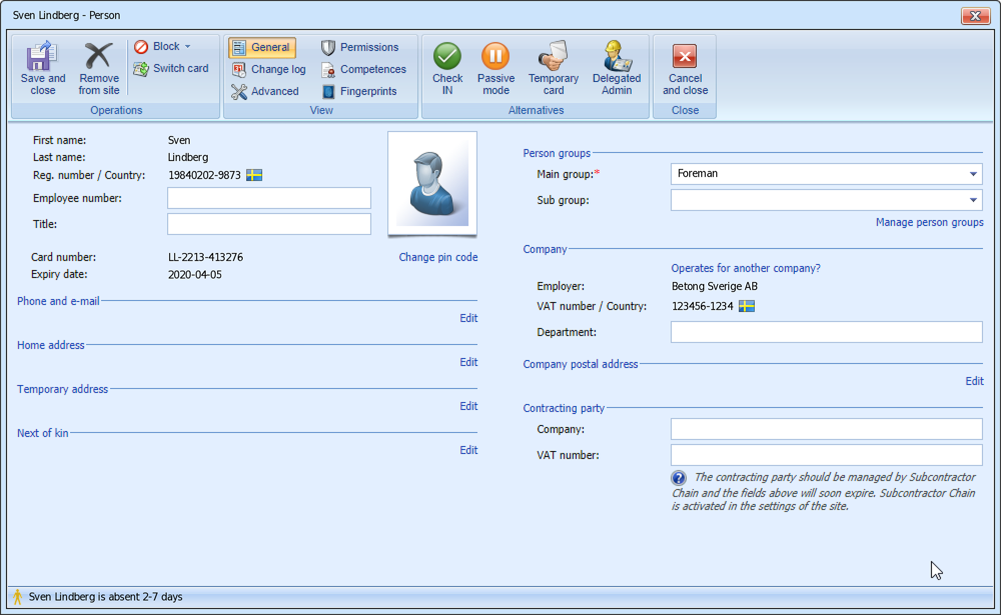
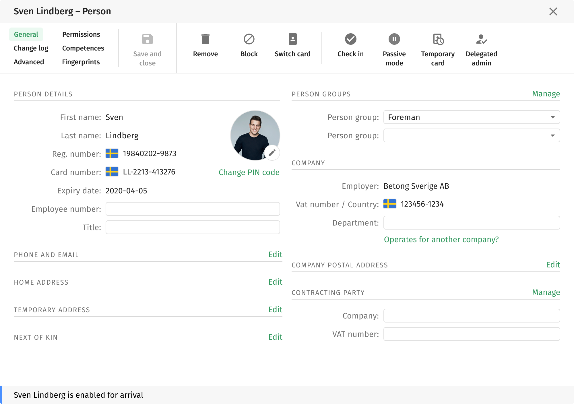
Person details modal
The window behind every person click.
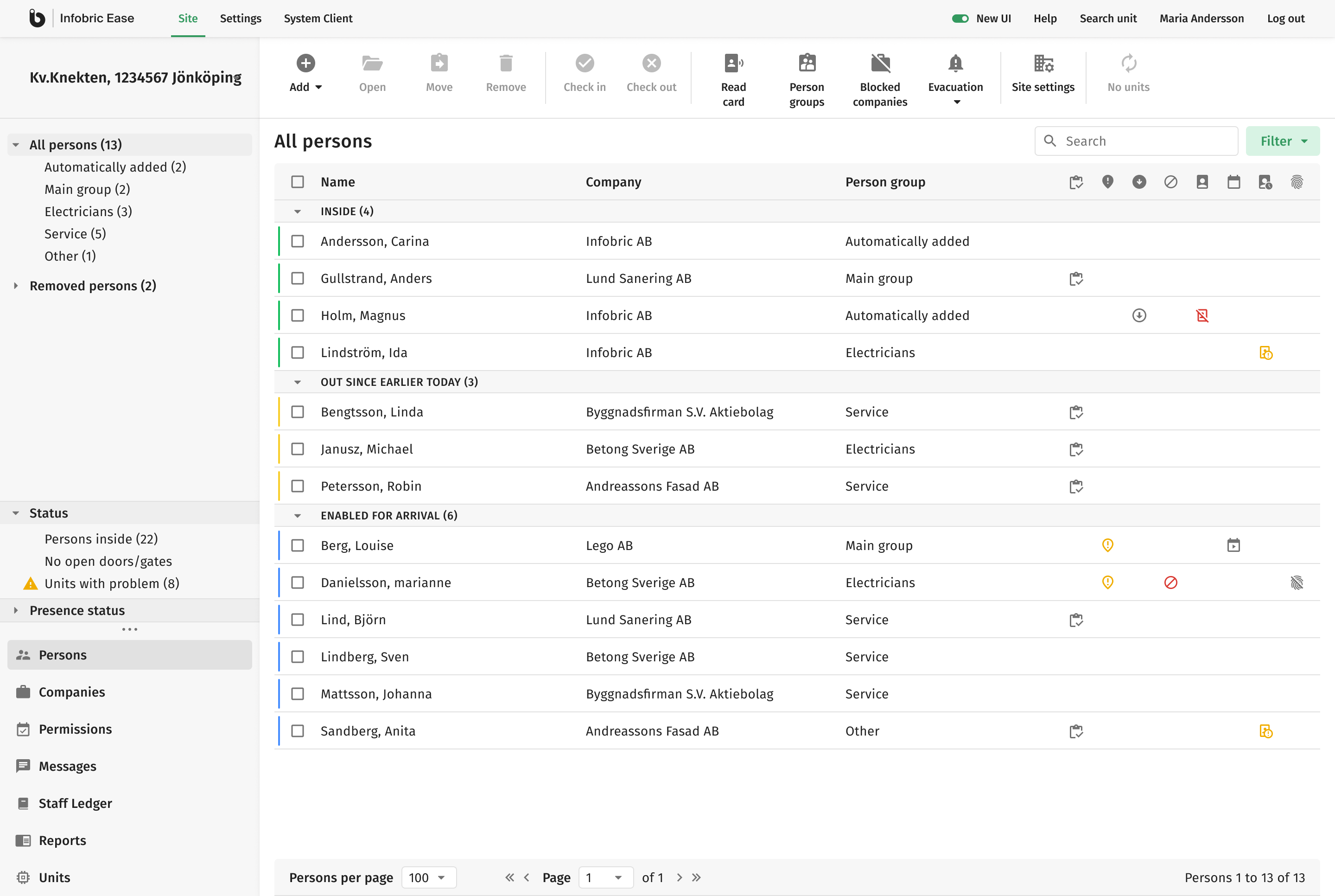
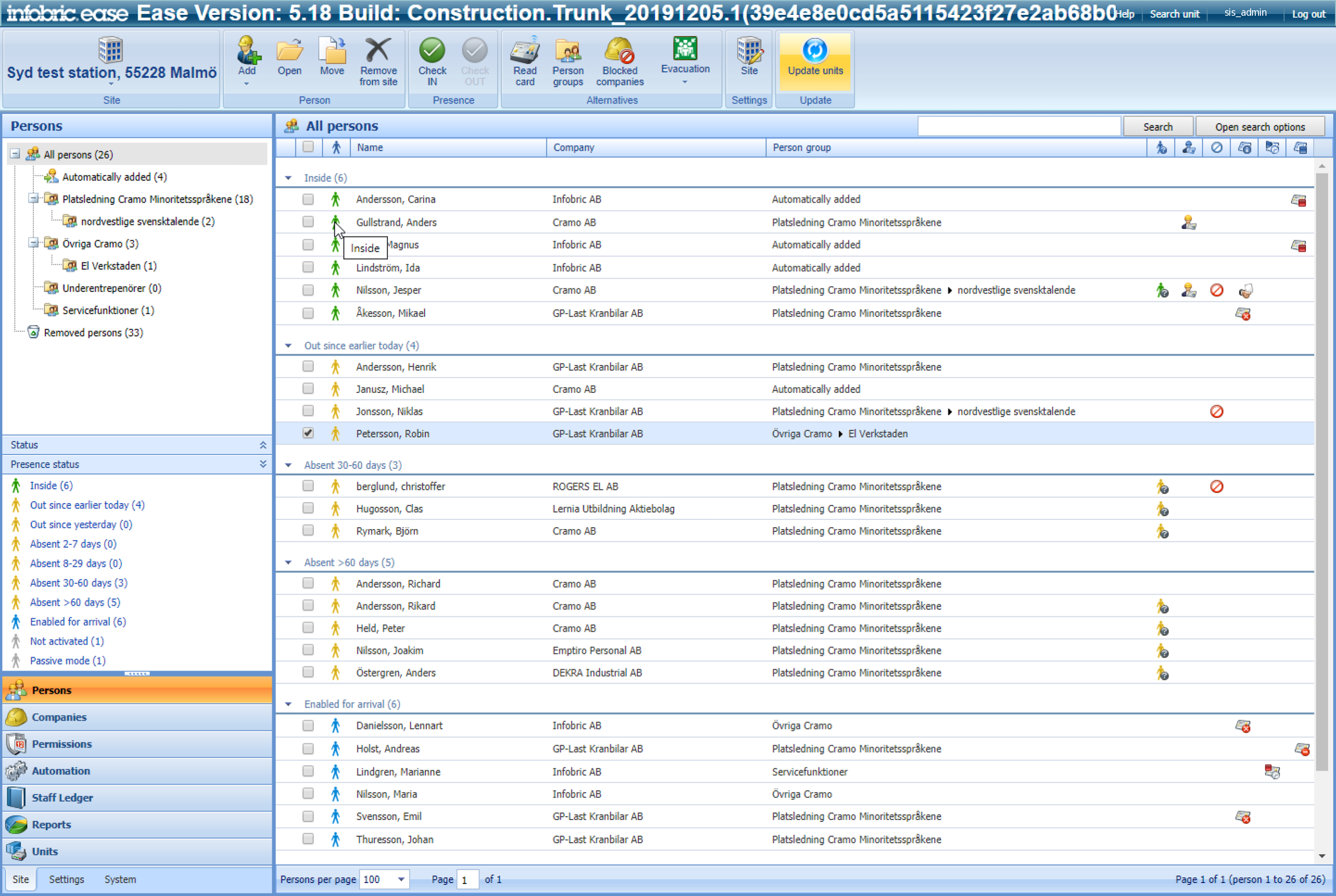
People grid
The primary screen for 10,000+ daily users at the time.
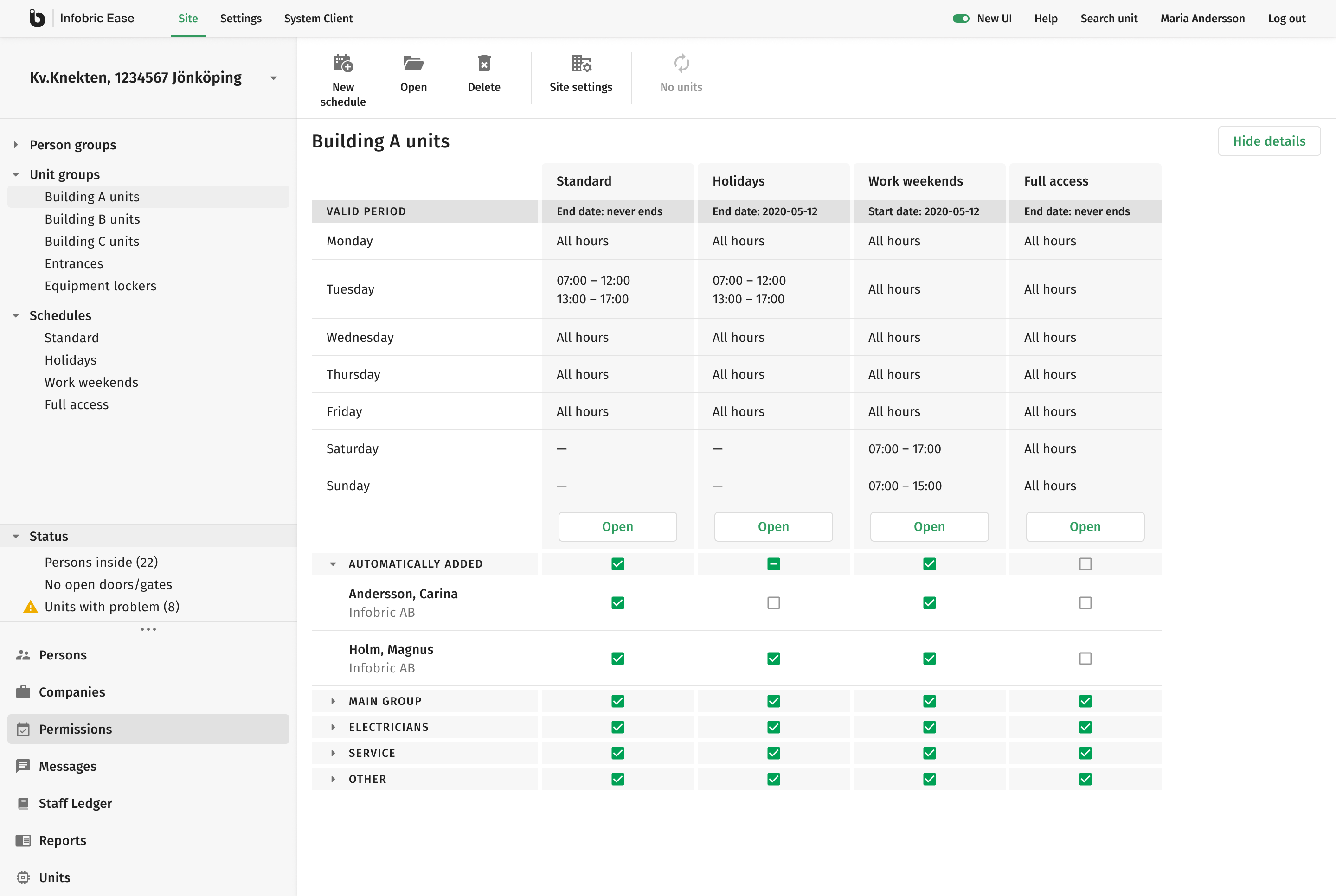
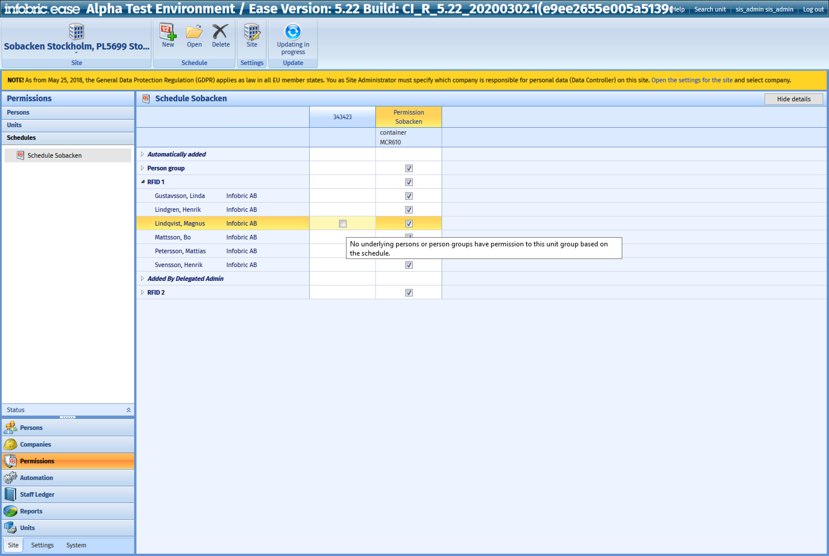
Permission matrix
Three axes in one view, so the standard grid didn’t fit.
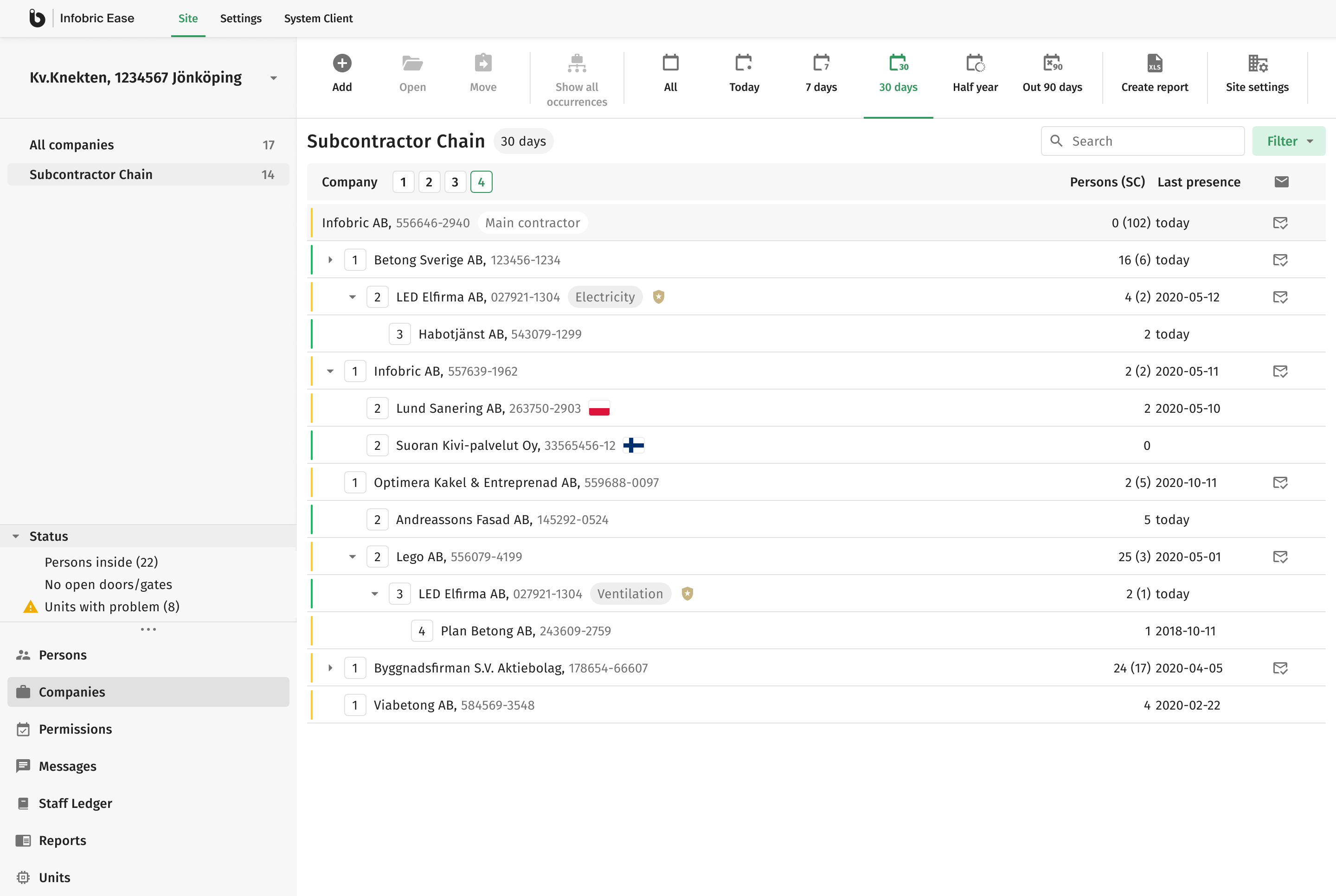
Subcontractor hierarchy
Three levels deep as standard, deeper by exception, shown as a tree.
Rollout: users opted in
The migration was not an afterthought of the redesign; it was the second thing I designed. 10,000+ people had ten years of muscle memory in this interface, and how they arrived at the new one would shape what they thought of it. So nobody found it there one morning: users opted in themselves, kept a one-click way back, and were asked why at the exact moment they left. The old UI didn’t disappear either. Its shutdown was announced in both interfaces a month ahead, then dated to the day, and the release answering their feedback went out a week before the switch was thrown.
-
Stage 1
Opt in
Announce the new interface in the old one; let users switch it on and return.
-
Stage 2
Default on
Make the new interface the default;
keep a one-click return. -
Stage 3
Old UI retired
Announced a month ahead in both UIs, then dated exactly; switched off only after the fix release shipped.
Feedback became the next backlog
Revenue couldn’t be separated from sales and new features, so the PM and I agreed on one measure we could own: whether users stayed. We fixed it before launch as the share of users who, free to leave, actually left. Every switch back was counted, and every instrument below fed the same question: was the new interface good enough to stay in?
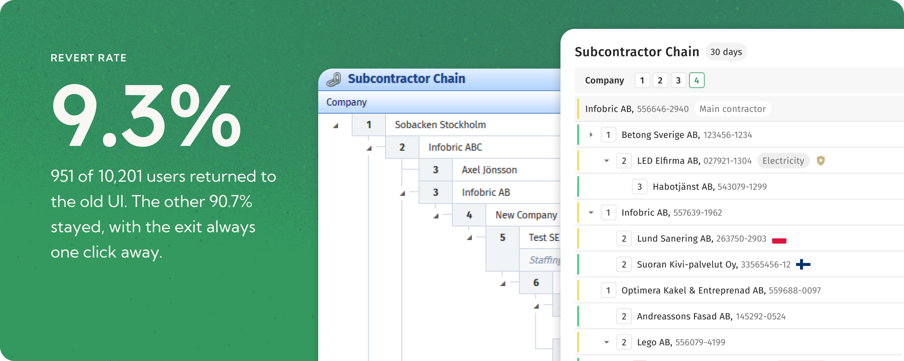
Revert rate
9.3%
951 of 10,201 users returned to the old UI. The other 90.7% stayed, with the exit always one click away.
Feedback instrumentation
- On exit
One-time “why did you switch back?” form
- Day 14
Automatic prompt after two weeks in
- Always
Feedback button in the new UI
The survey reached people when frustration peaks, above all at the exit. So I treated the 3.8 average across 466 ratings as background and the words as the signal: 190 comments in Swedish and Norwegian, coded one by one. Five themes came back often enough to act on, or to set aside on the record.
-
Density
Larger type and taller rows improved reading but nearly halved visible records. For site managers, scanning throughput was part of the task.
ShippedAdded a setting to control display density
-
Performance
Refreshes were slow long before the redesign, but users blamed the new update anyway.
FundedBuilt the case that secured client budget
-
Palette
Most comments were about preference: too gray, too white, too minimal. A smaller group relied on color for contrast and glanceability.
Not actionedKept as a finding; no task raised
-
Change resistance
Roughly a sixth of comments, several openly acknowledging habit rather than fault.
AcceptedAccepted as the cost of the change
-
Bugs and feature requests
About two dozen comments described broken behavior or missing functionality, not the redesign.
SeparatedSeparated from design feedback and logged
Compact density
How density feedback was addressed
We did not choose readability over throughput. We shipped compact mode before the old UI was retired, giving high-volume users more rows without undoing the new structure.
Outcome
The redesign outlasted the project. Infobric set up a small development team dedicated to the interface, to own the design backlog, which had never been documented before. Its members mainly work on design debt and sometimes step in to help the main product team with business features. The team still works today.
What I would change
Fourteen days did not measure settled adoption; it measured the first disruption of a long-standing routine. Next time I would keep the reversible rollout, run feedback longer, and measure again after the first fixes shipped.