
Ease CheckIn
View in store
A mandatory app, rated 2.5. Redesigned to 4.9
- Timeline
- 2022–2023
- My role
- Product designer
- Team
- PM · developers · tester
- Product
- iOS and Android
Context
Ease CheckIn is Infobric's mobile app for construction site access, used by 160,000+ workers and site managers across Sweden and Norway. It carries the access and identity flows across Bluetooth, NFC, card readers and biometrics, and it is the first thing a worker opens when they arrive at a construction site. I designed and improved all of its major features and drove the full redesign of its core functions.
 Scope and constraints
Redesign the core flows of a mandatory field app without disrupting the existing experiences; adapt to a new Infobric brand identity.
 My contribution
Designed and improved all major features of the app. Set the direction for the full redesign. Planned and moderated ten usability sessions on the beta build, turned the findings into the following iterations, and aligned cross-functionally before the refined experience shipped to production.
Who is using it
Workers and site managers in Sweden and Norway, at the gate, in all weather.
The app is required by law, so it has to work for people who never chose it.
Low motivation
The main action is one swipe and nothing else competes with it.
Distrust of tracking
The map shows the geofence and the reason before a check-in fails.
Roles and rights
What each person can see and do depends on their permissions and roles (the app has three).
Hands full, sky open
Big targets, high contrast, no small text in the field.
Why the redesign happened now
The brief was a color change to match the new brand. In four years the app had been redesigned once and rebranded twice, each change decided from above in a period of frequent changes in leadership, and none of them made for the people using it. This would have been the fourth new look. The team around me seemed underused and wanted a harder problem than a repaint, so I proposed we use the update to fix what users actually struggled with.
What we set out to fix
We went through every recent review in both app stores and the feedback that had reached us through support, and asked what was hardest for users and what mattered most to the business. Three things stood out as the major ones; smaller improvements came along with them.
Geofences without guidance
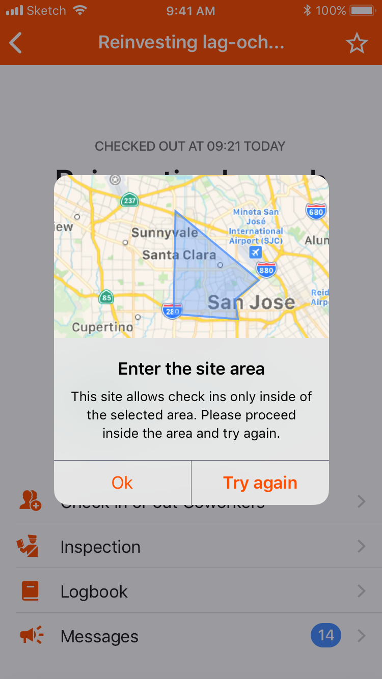
More and more sites required a check-in from inside a geofence, and workers could not opt out.
The map appeared only after a failed attempt, in an alert: small, static, with the area drawn but no sign of where the worker stood. On large sites with several geofences it was hard to tell where the boundary ran, and the fence itself or the phone’s GPS could be off by some meters. Our job was to make the required path clear for honest users.
Too much effort to check in
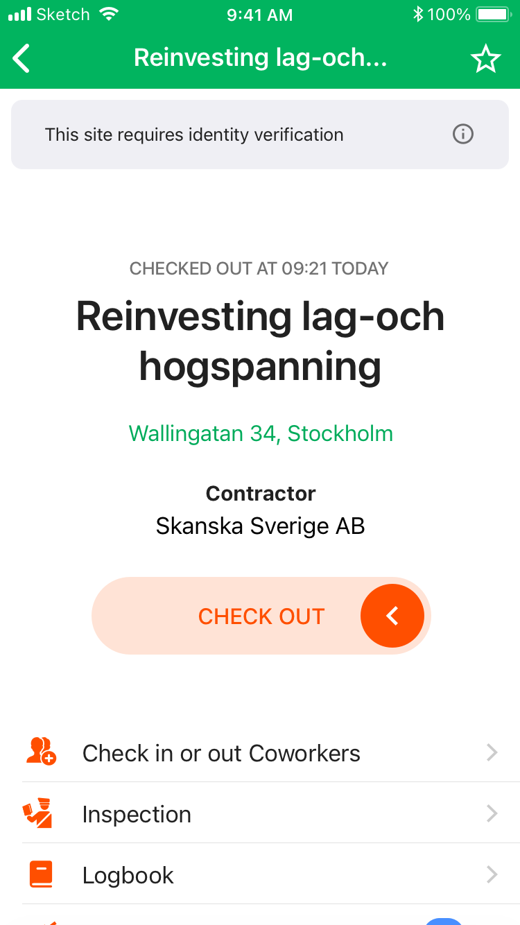
A small but steady stream of complaints said the button needed precision. The slider is meant to take some effort, to stop check-ins by mistake, but it took too much.
Two patterns, one app
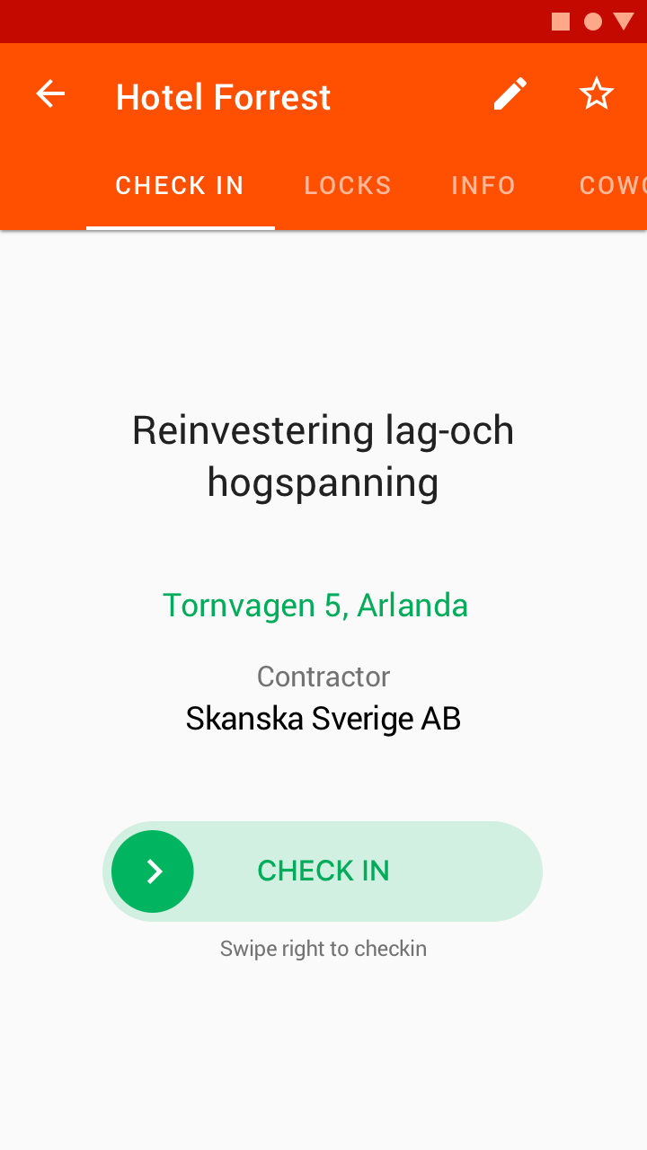
On Android, the tabs that did not fit on the screen stayed out of sight, and some users never found them. Two patterns also meant designing and supporting everything twice.
Where it started
What changed
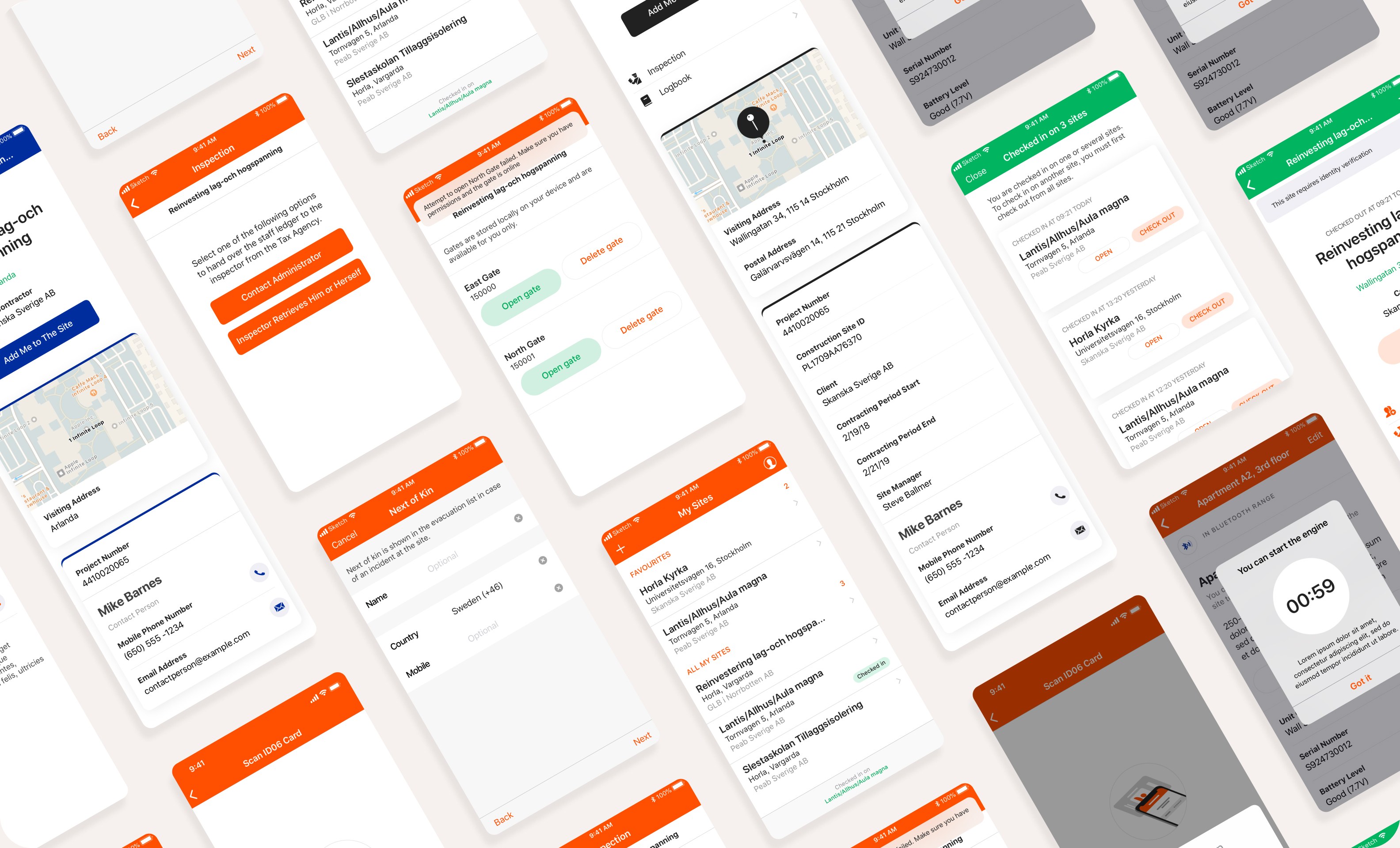
As the app grew, new tools had to be reachable at once, while the eye stays on the check-in, the action the product exists for. The redesign surfaced what was already there and gave the app one visual language with the rest of the Infobric ecosystem. Three changes carried most of the effect.
Improving check-in button
The button grew and got easier at the same time. A swipe is deliberate where a tap is not, so the slider stays, but it now takes only part of the track: once the thumb has gone far enough, the check-in completes on its own, with haptics and a hint showing where to go.
Simplifying navigation
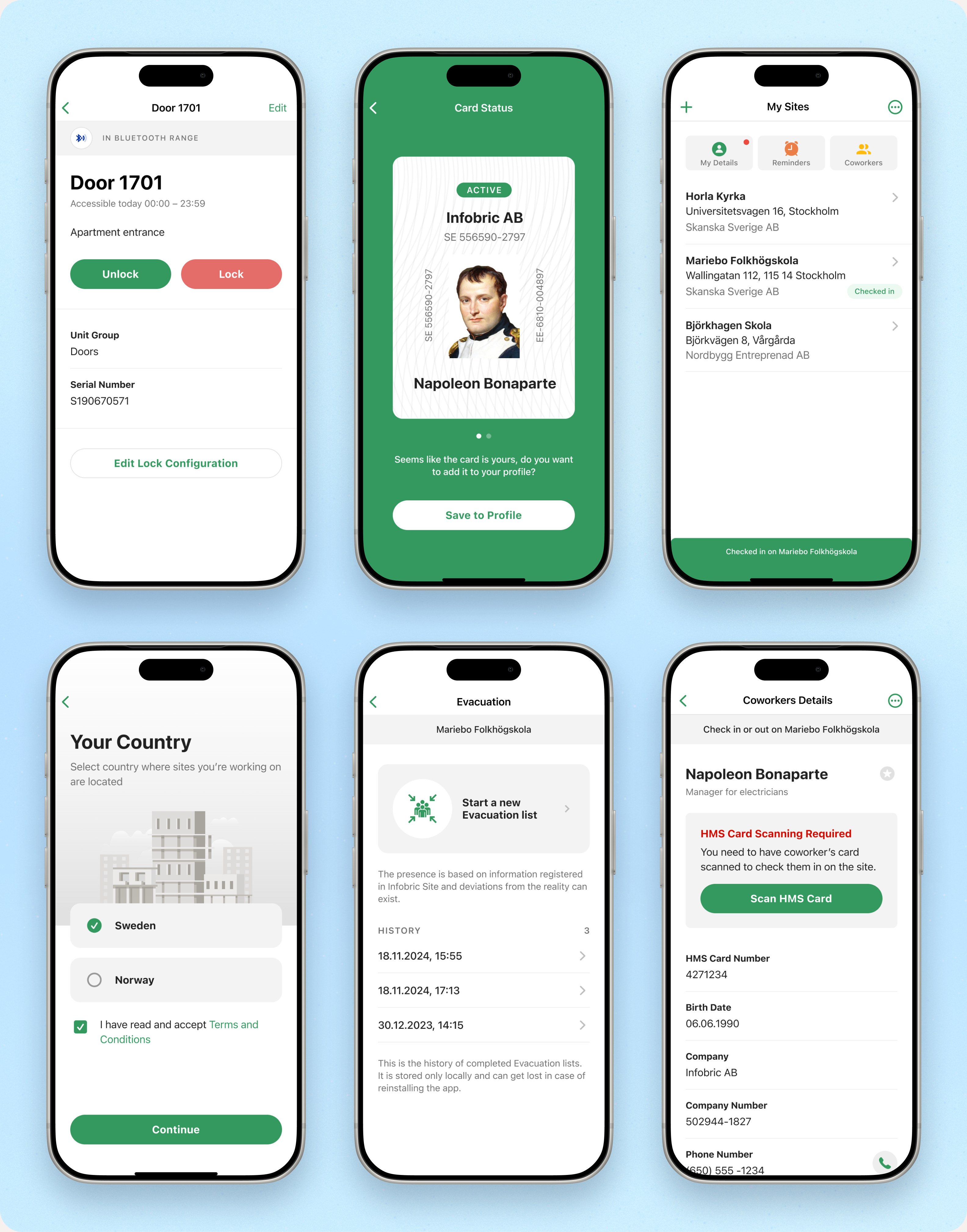
One screen, read top to bottom: where you are (the map and the geofence), what to do (the check-in at thumb height), where to go next (tiles with icons, always visible). The tabs that nobody found on Android are gone.
Cohesive across platforms
One visual language on both platforms. Platform conventions stay where they matter (back gestures, system dialogs); everything the user learns is the same on both.
Tested before it shipped
The redesign was judged before it reached production, and again after. I planned and moderated 10 usability sessions on the beta, with tasks taken from real use and from the flows users had struggled with most.
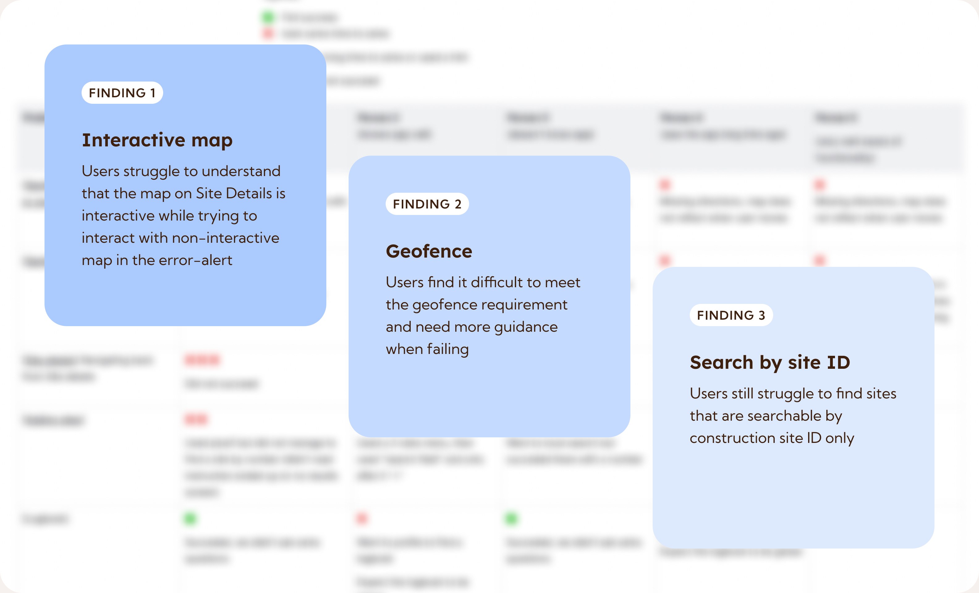
Three findings came up often enough to change the design before release.
Final solution
Testing showed the map in the wrong place twice: a still image in the error alert that people kept tapping, and a fully interactive map on Site details that nobody touched. I took the map out of the alert. When a check-in fails, the alert now leads straight to the map in full screen, showing the geofence and where the worker is. Everyone understood it at once, and discovered the full-screen view on the way. Searching by site ID, the third finding, got clearer guidance.
What workers wrote
-
★★★★★ Google Play
”Ett svep och ett tryck och, voilà, I’m all in!”
One swipe, one tap and, voilà, I’m all in! Peter E., Google Play, May 2023
-
★★★★★ Google Play
”Även dom som inte är raketforskare förstår vad dom ska göra.”
Even those of us who aren’t rocket scientists know what to do. Åke H., Sep 2023
-
★★★★★ Google Play
”Det enklaste och mest praktiska systemet med Geofence.”
The simplest and most practical system, with geofence. Lars M., May 2023
Outcome
The clearest result is the rating. On Google Play it climbed over time from around 2.5 to 4.9, among 5,120 reviews, and has held there since; it is still 4.9 in September 2026. Support saw the same direction: fewer problems finding sites, and fewer with checking in on geofenced sites.